
Social Media Branding 101: Building a Consistent Visual Identity
Every strong brand you recognize instantly — before you even read a word — has one thing in common: visual consistency.
That's not an accident. It's a small set of deliberate choices, repeated every single time. It's also the exact idea Social Template Studio is built around: helping businesses apply that same consistency to their own social media, without needing a design background.
The good news is you don't need a full brand book or a design degree to get there. You need three things locked in, and a system for applying them consistently.
What Visual Branding Actually Means
Visual branding isn't about having a "nice looking" logo or a pretty color scheme in isolation — it's about repetition. The same colors, the same fonts, the same layout logic, showing up the same way, every time your audience sees your content.
This is what makes a brand feel established rather than scattered. Two businesses can have equally good individual designs, but the one that repeats a consistent visual language will always look more professional and more trustworthy.

The Three Elements to Lock In First
Before designing a single post, decide on these three things — everything else builds on top of them:
Brand colors — 2–3 core colors, used the same way every time, not swapped out post to post
Fonts — one heading font, one body font. Resist the urge to add a third "just for this post"
Logo placement — same size, same corner, every time
Once these three are fixed, your content automatically starts to feel cohesive — even before you think about layout or imagery.
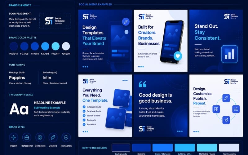
Consistency Beats Novelty
A common mistake: chasing a "fresh" look on every single post. New layout, new font, new color combination — each post technically looks fine on its own, but the feed looks disorganized.
Audiences don't consciously catalog your color codes, but they do notice when something feels "off" or unfamiliar — even if they can't say exactly why. Consistency isn't boring; it's what makes a brand instantly recognizable in a crowded feed.
This is also why building a reusable template system works better long-term than designing every post individually — the structure enforces consistency automatically, instead of relying on you remembering your own rules every time.
Applying This to Every Platform
Your visual identity should hold up the same way whether someone sees your content on Instagram, Facebook, or your website. A few practical checkpoints:
Does your logo appear the same way across every platform's post sizes?
Are you using the exact same hex codes, or "close enough" colors that drift slightly?
Would someone recognize your content as yours with the caption hidden?
If the answer to that last question is no, that's usually a sign the visual system needs tightening, not necessarily a full redesign.
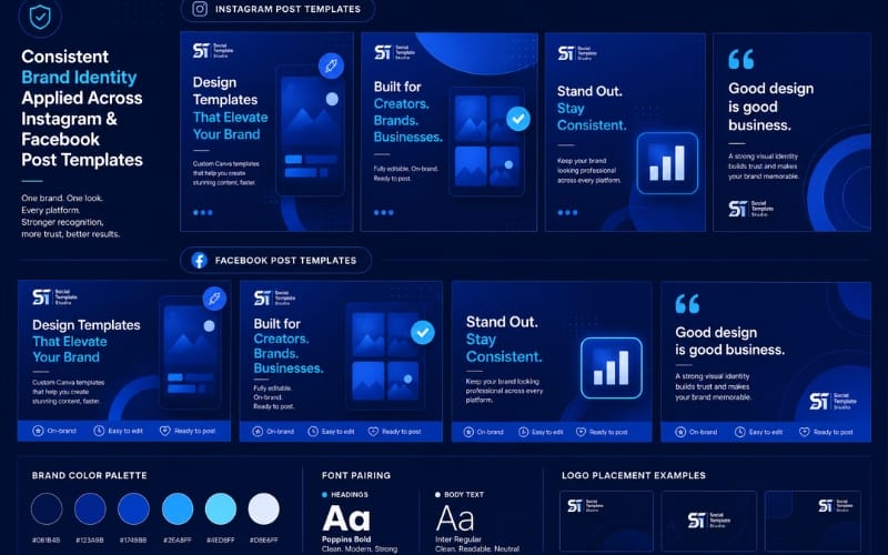
If you're applying this system to formats like carousels, these carousel post ideas show the same consistency principle in action across multiple slides.
Building a System, Not Just a Style
The real goal isn't a one-time "brand look" — it's a repeatable system you (or anyone helping you post) can apply without re-deciding from scratch every time. That's the difference between a brand that looks intentional after 100 posts, and one that looks like it was designed by five different people.
If you want a deeper look at exactly how a reusable template system works in practice, this connects directly to how I approach creating on-brand social media posts — the same three-element system applies here.
Want your brand's visual identity locked into a system you can reuse every time you post?
I build custom Canva template systems — your colors, fonts, and logo, applied consistently across every design.
Like What You See? Let's Build Yours.
I design every template from scratch — no generic layouts. Order securely through Fiverr and get your first draft fast.
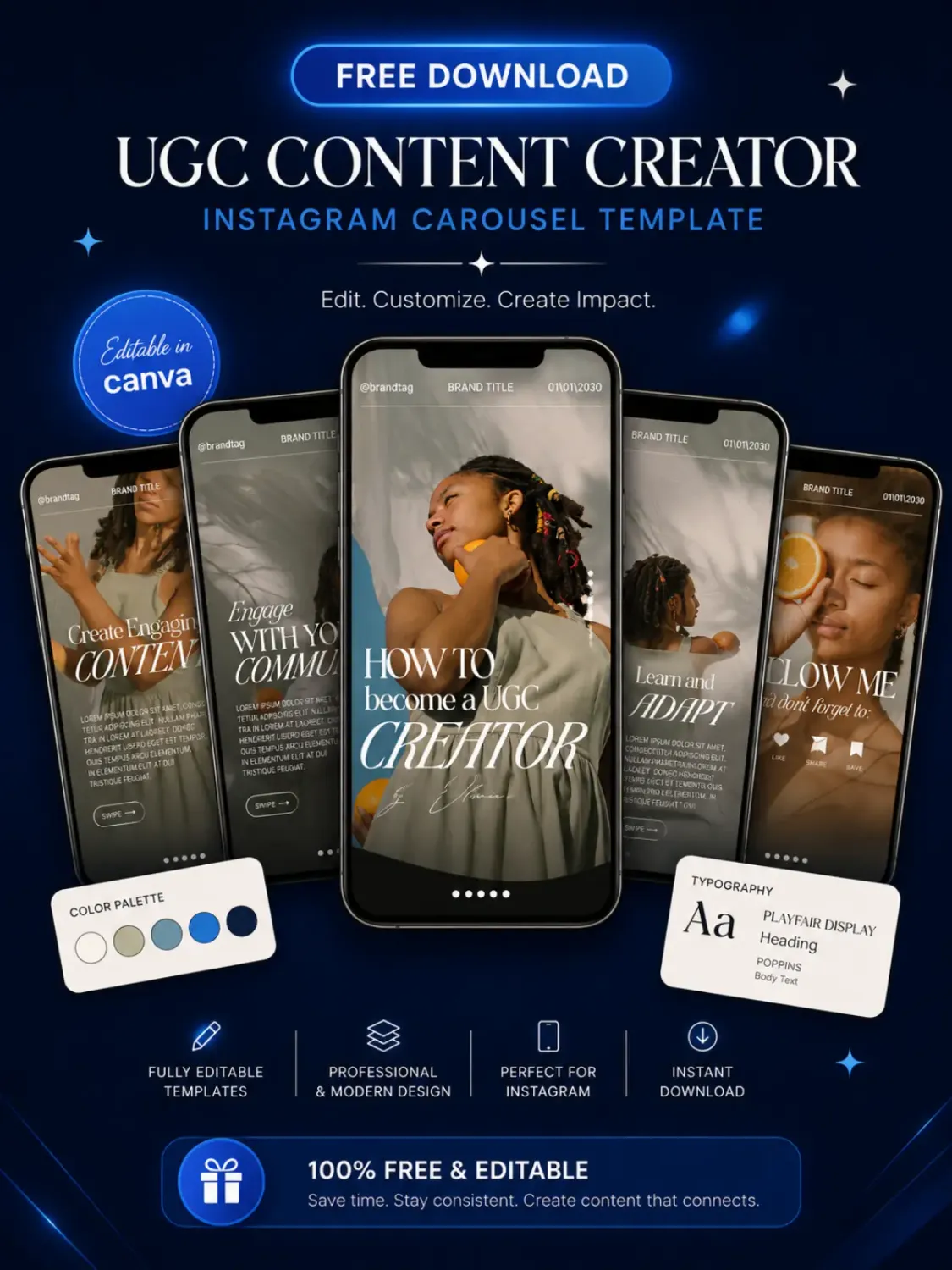
Download Your Free Canva Template
Enter your email address to receive instant access to your free editable Canva template.
We respect your privacy. No spam. Unsubscribe anytime.


© 2026 Social Template Studio. All rights reserved.