
Instagram Post Templates: Why Consistency Wins Every Time
Every Instagram post you publish is a small decision: design something new from scratch, or reuse a system you've already built.
Most businesses default to the first option — a fresh layout every time, because it feels more "custom." But the businesses whose feeds actually look professional are usually doing the opposite: using the same template structure, again and again.
Here's why consistency wins, and how a template-based approach actually beats one-off designs.
The Problem With Designing Every Post From Scratch
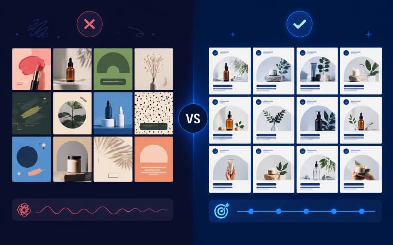
Starting fresh each time feels flexible, but it creates a hidden cost: your feed never settles into a recognizable pattern.
Every post technically looks fine on its own. But viewed together — which is exactly how people actually browse Instagram, scrolling through multiple posts in a row — the lack of a repeated structure reads as disorganized, even if no individual post looks bad.
There's also a practical cost: starting from zero every time takes longer than editing an existing template, which means more time spent designing and less time spent on everything else running a business requires.
What a Template System Actually Solves
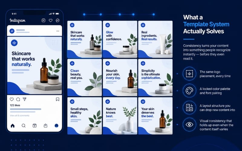
An Instagram post template isn't just a time-saver — it's a recognition tool. When your logo sits in the same place, your fonts stay the same, and your color palette doesn't shift post to post, your audience starts to recognize your content before they even read it.
This matters more than it sounds. Recognition is what turns a casual scroller into someone who actually stops on your post — and that split-second recognition only happens with repetition, not novelty.
A good template system gives you:
The same logo placement, every time
A locked color palette and font pairing
A layout structure you can drop new content into
Visual consistency that holds up even when the content itself varies
Consistency Doesn't Mean Repetitive
A common concern: won't reusing the same template make every post look identical and boring?
Not if the template is built correctly. A good system has enough flexibility built in — swappable colors within your palette, different image placements, varied headline lengths — while keeping the underlying structure (logo position, font, spacing) locked. The content changes; the framework doesn't.
This is the same principle behind why brands like Canva, Adobe, and other design-forward companies have such recognizable social feeds — not because every post is identical, but because every post shares the same visual DNA.
How This Plays Out in Practice
Say you post 3 times a week. Over a month, that's 12 posts. Designed individually, that's 12 separate design decisions — fonts, colors, layout, logo placement, each one a fresh judgment call.
With a template system, those decisions get made once, during setup. Every post after that becomes a matter of swapping text and images into an existing structure — faster to produce, and automatically consistent, since the framework enforces it rather than relying on you remembering your own rules each time.
If you want to see this principle applied to carousel content specifically, these carousel post ideas show the same reusable-structure approach in a multi-slide format.
Building Your Own Template System
If you want to set this up yourself, start with the same three fixed elements we've covered before: colors, fonts, and logo placement. Lock those in first, then build a small set of post templates (announcement, quote, promotion, product) around that fixed foundation.
If building it yourself isn't the best use of your time, that's exactly what a custom Canva template system is designed to solve — professional setup once, unlimited reuse after that.
Ready for a Feed That Looks Consistent, Not Random?
I build custom Canva template systems — your colors, fonts, and logo, applied the same way every time. Set it up once, reuse it for every future post.
Like What You See? Let's Build Yours.
I design every template from scratch — no generic layouts. Order securely through Fiverr and get your first draft fast.
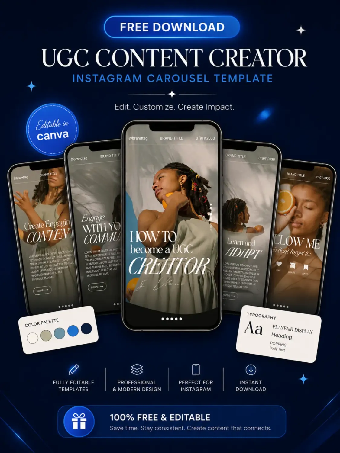
Download Your Free Canva Template
Enter your email address to receive instant access to your free editable Canva template.
We respect your privacy. No spam. Unsubscribe anytime.


© 2026 Social Template Studio. All rights reserved.