
Real Estate Carousel Design: Stop the Scroll
Buyers scroll through dozens of property listings before they finish their morning coffee. Most of those posts blend together — a phone photo, an address, a price — and none of them earn more than a second of attention.
That's not a property problem. It's a presentation problem.
In this article, you'll learn why standard listing posts fail to hold attention, how carousel design fixes it, and what the actual design process looks like when it's built properly — including a real case study you can see in full.
The Problem: Why Buyers Keep Scrolling
Instagram feeds are noisy, and real estate content is some of the most repetitive content on the platform. A few specific issues show up again and again:
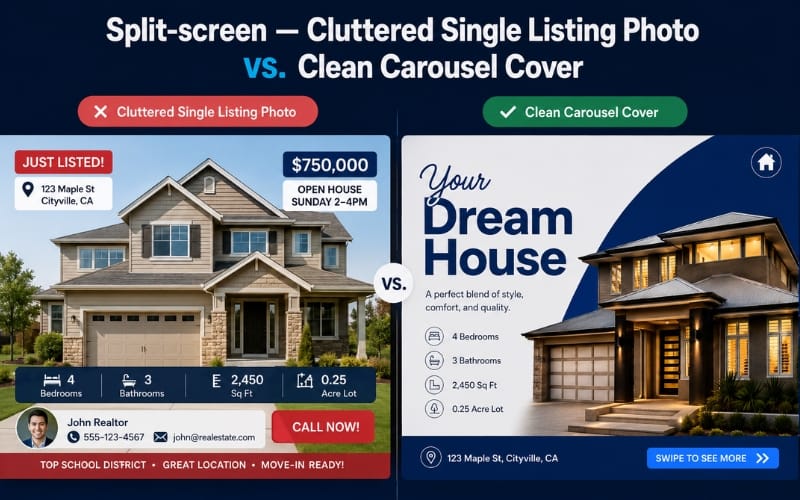
Information overload. Price, square footage, bedroom count, and a call-to-action all crammed into one image, forcing the viewer to do work the design should be doing for them.
Every listing looks the same. Without consistent branding, one agent's post is visually indistinguishable from the next — which means buyers stop noticing who posted it at all.
Too much text in one image. Dense captions baked directly into the image force the eye to stop and read rather than glance and understand.
Weak visual hierarchy. Nothing tells the viewer what to look at first, second, or third — everything competes for attention simultaneously.
No storytelling. A single photo announces a property. It doesn't build any curiosity to see more of it.
None of these are about the home being unattractive. They're about the post giving buyers nothing to stop for — and on a platform built entirely around the scroll, "nothing to stop for" is the same as invisible.
The Psychology Behind Social Media Scrolling
People stop scrolling for content that feels:
Easy to understand at a glance
Visually organized
Curiosity-driven
Professional-looking
A single image has to do all of that work at once, and it rarely can. A carousel spreads the work across multiple slides — which means each slide only has to do one job well, instead of every job simultaneously.
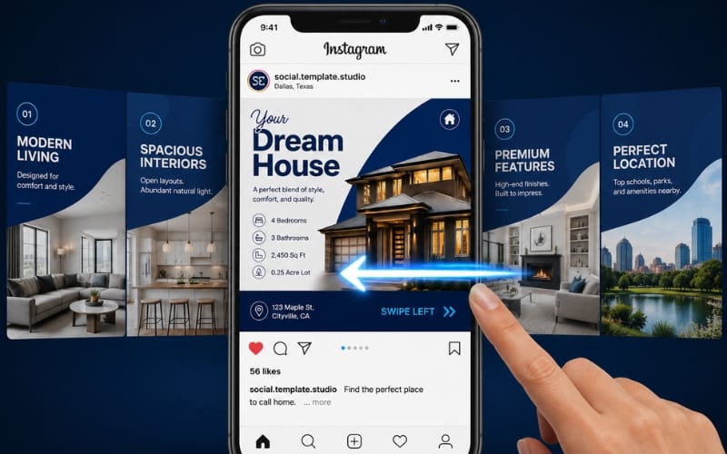
That structural shift matters more than it sounds. A single overloaded image asks the viewer to process headline, photo, and detail all in the same glance. A carousel lets the hero slide do just one thing — earn attention — while every other slide does its own single job afterward. That's the difference between demanding attention and earning it in stages, and it's a large part of why carousel posts consistently generate more swipes, comments, and saves than static posts, particularly in categories like real estate where there's naturally more to show than one image can hold.
Why Carousel Posts Perform Better for Property Listings
The advantage isn't the format itself — it's what the format allows: a sequence, instead of a single advertisement.
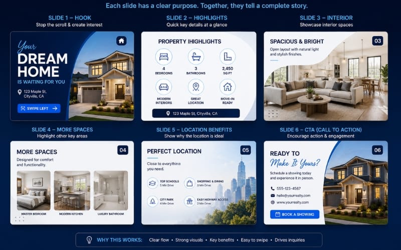
A well-structured property carousel might look like this:
Hero image — the strongest exterior or interior shot, doing the job a headline does in an ad. This slide's only responsibility is earning the first swipe.
Interior highlights — kitchen, living space, standout features, shown with enough breathing room that each photo actually registers rather than competing with neighbouring ones.
Floor plan — practical information buyers actively look for, and a slide type most single-image posts skip entirely because there's no room for it.
Location benefits — schools, commute, neighborhood value. This is where the listing stops being "a house" and starts being "a life."
Lifestyle — what living there actually feels like, not just what it looks like. Often the most emotionally persuasive slide in the whole sequence.
Call to action — the next step, stated clearly, with nothing competing for attention on that slide.
Each slide earns the next swipe instead of trying to say everything at once. That's the difference between an advertisement and a story — one asks for attention immediately, the other builds it gradually, and buyers respond very differently to each.
Five Elements Every High-Performing Property Carousel Needs
Regardless of the specific listing, these five elements show up in every carousel that actually performs:
A strong headline on the first slide — it decides whether anyone swipes at all, and it's worth spending more design time on than any other single element.
Premium photography — even a great layout can't fix a poor photo. If the photography is weak, no amount of design work fully compensates.
Consistent branding — colors, fonts, and logo placement that stay identical across every post, so buyers start recognizing your listings before they even read who posted them.
Clear typography — legible at a glance, especially on mobile, where the vast majority of this content actually gets viewed.
A simple CTA — one clear next step, not three competing ones. "Message me," "Call now," or "Visit link" — pick one per carousel, not all three.
None of these require a redesign for every listing. They just need to be built once, correctly, into a system you reuse — which is exactly the difference between a one-off post and a template.
A Before-and-After Example
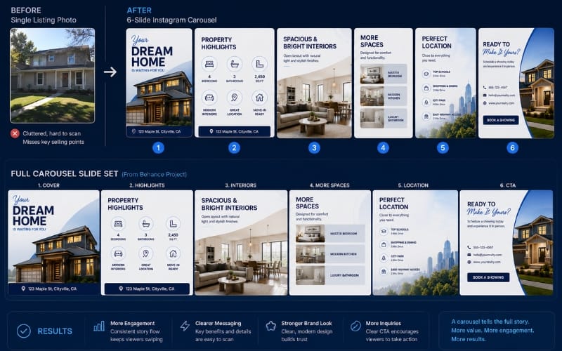
Before:
A single cluttered image
Small, hard-to-read text
No visual hierarchy — everything competing for attention at once
After:
A clean, multi-slide carousel
Consistent branding across every slide
Deliberate spacing and readable typography throughout
This is exactly the shift I worked through recently while building a complete Canva carousel template system for a real estate brand — five cohesive templates, from hero banner to closing CTA, designed to give every listing the same premium, consistent presence rather than a one-off design each time.
You can see the full project — every slide, the full design breakdown, and the finished system — in my Behance case study on real estate carousel design. It's the clearest way to see this framework applied to an actual brand rather than described in the abstract.
How I Designed This Carousel
A few of the decisions that shaped the system, in case it's useful for your own redesign:
Target audience. Who the buyer actually is shapes tone, not just visuals — a first-time buyer carousel reads differently than a luxury listing one, and the design should reflect that from the very first slide.
Color palette. Chosen to feel premium and trustworthy without competing with the property photography itself. Real estate photography already carries strong color and light; the template's palette needs to support it, not fight it.
Typography. A strong, legible headline font paired with a simpler body font, kept identical across every slide so the brand feels unmistakably consistent even across dozens of different listings.
Content hierarchy. Deciding what each slide's one job is before any visual design work starts — this decision happens on paper, before Canva is even opened.
Mobile-first layout. Every slide tested at phone-screen size first, since that's where nearly all of this gets viewed. Anything that only looks good on a desktop preview gets redesigned.
CTA placement. Always the final slide, always one clear action, never buried mid-carousel where it competes with content slides for attention.
This is the part of the process that rarely gets shown publicly — most portfolios show the finished result, not the reasoning behind it. That reasoning is usually the actual value being paid for.
Final Thoughts
Buyers don't ignore listings because the property isn't attractive.
They ignore listings because the presentation doesn't give them a reason to stop scrolling.
Carousel design fixes that — not by working harder to grab attention in one image, but by spreading the story across a few slides, each one earning the next swipe until the buyer reaches the point of actually reaching out.
FAQ
Five to seven is the sweet spot — enough to tell a full story (hero, interior, floor plan, location, lifestyle, CTA) without so many slides that people drop off before reaching the call to action.
No. A well-built template system is designed to be reused — you swap photos, text, and listing-specific details, while the branding, colors, and layout structure stay identical every time.
The underlying framework — hook, feature highlights, floor plan, location, lifestyle, CTA — applies regardless of the tool. Canva simply makes it fast and beginner-friendly to execute consistently without design software experience.
Not always — a single striking photo can work for a quick update or a sold announcement. Carousels earn their value specifically when there's a full story to tell: a new listing, an open house, or a property with multiple standout features worth showing individually.
It depends on scope, but a five-template carousel system (covering hero, features, floor plan, location, and CTA slides) is a realistic, well-scoped project — not an open-ended one, since the goal is a reusable system rather than one-off designs.
Ready to Apply This to Your Own Listings?
If your current posts are relying on a single photo doing all the work, a template system built around this framework can change that — without requiring a redesign for every new listing.
See the full case study breakdown on my Behance project, or if you're ready to get a custom carousel system built for your own brand, visit Social Template Studio or order directly through Fiverr.
Like What You See? Let's Build Yours.
I design every template from scratch — no generic layouts. Order securely through Fiverr and get your first draft fast.

Download Your Free Canva Template
Enter your email address to receive instant access to your free editable Canva template.
We respect your privacy. No spam. Unsubscribe anytime.


© 2026 Social Template Studio. All rights reserved.